Our Approach
Rather than designing around age demographics alone, we focused on what united the brand's audience.
Although the target market ranged from students to working professionals, a common thread emerged: a desire to present themselves with confidence and good taste.
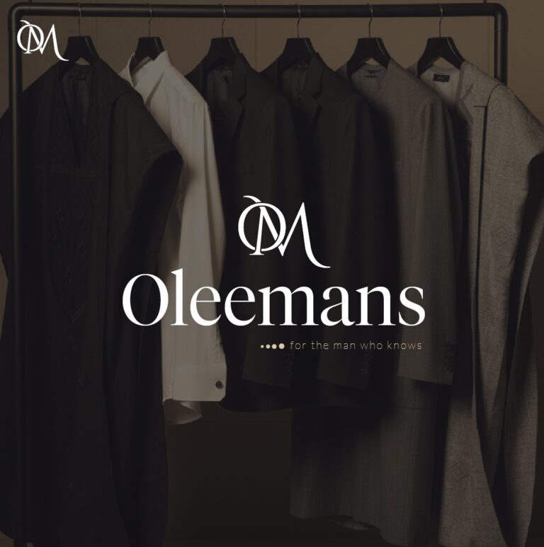
This insight informed the development of the brand name "Oleemans." Derived from the founder's original idea, "Olivia," the name evolved into a more distinctive identity that carried a stronger masculine character while remaining memorable and premium in feel.
The visual identity was then developed to reinforce this positioning. A combination of brown, milk, and gold tones was selected to communicate sophistication, refinement, and timeless style. Typography and supporting brand elements were carefully chosen to create consistency across every customer touchpoint.
The result was a brand system designed to help the business present itself with clarity, confidence, and professionalism from day one.