Our Approach
We began by conducting extensive market and audience research to understand Mayovest's position within the digital skills ecosystem.
This included:
Through this process, it became clear that Mayovest needed more than a visual refresh. It required a clearer identity and a structured system for communicating its value.
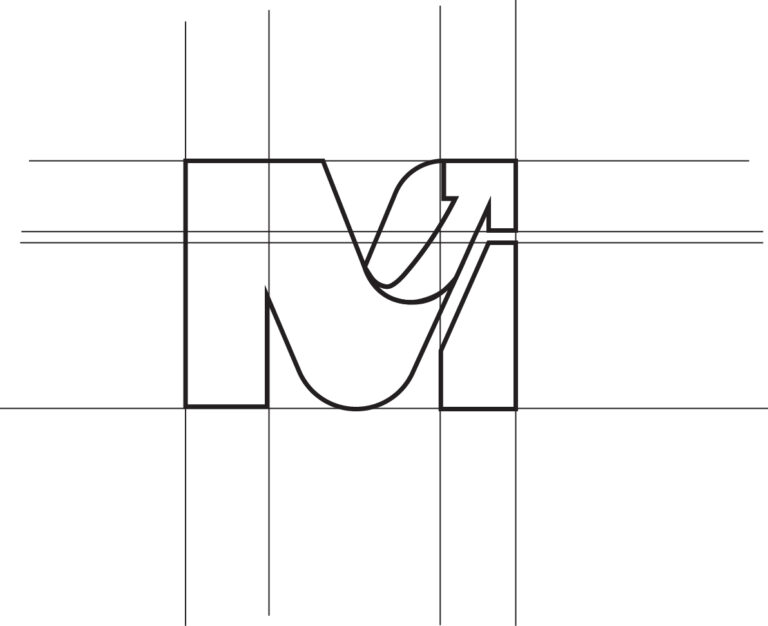
The logo was refined into a simplified "M" symbol featuring an upward arrow; a visual representation of growth, progress, and upward mobility, all of which reflected the organization's mission.
Typography and supporting visual elements were selected to reinforce the values of proficiency, credibility, and integrity, helping the brand communicate professionalism while remaining accessible to young adults
To ensure long-term consistency, a comprehensive brand framework was developed, including:
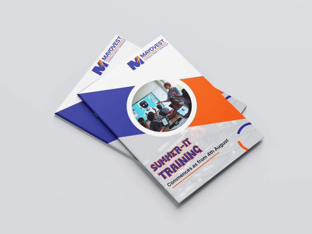
This framework provided the team with a clear system for maintaining consistency across every audience touchpoint.
A structured implementation roadmap was developed to guide execution.
The plan focused on:
To ensure the strategy could be maintained beyond the engagement, training and implementation support were provided to key team members responsible for content and communications.