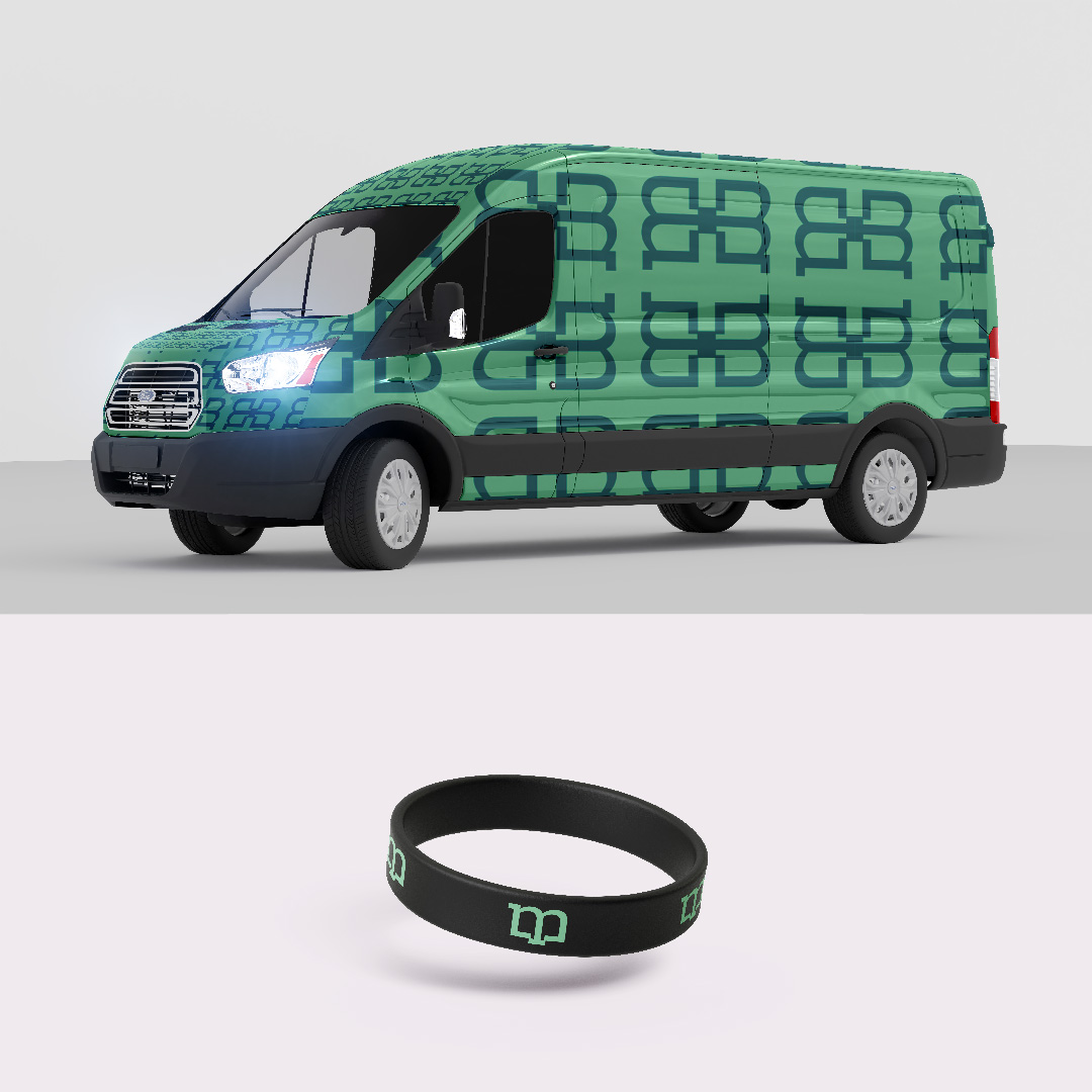
Emerald Crete

Brand Identity Development & Visual Storytelling

Industry: Construction & Decorative Outdoor Spaces
Services: Brand Identity Design, Logo Design, Color Palette Development, Typography System, Visual Storytelling, Brand Mockups
Timeline: 27 Days
Primary Goal: Develop a visual identity capable of communicating Emerald Crete's craftsmanship, transformation process, and premium positioning while providing a foundation for the brand's online presence.

CHALLENGE

Emerald Crete specialized in transforming ordinary concrete surfaces into decorative outdoor environments for luxury residential properties. The quality of their work was evident in the finished spaces they created.

The challenge, however, was that the brand itself had no visual identity capable of communicating that same level of craftsmanship. There was no established logo, color system, or visual language. More importantly, there was no story.

The founders were not interested in a logo for the sake of having one. They wanted an identity that reflected the care, precision, and transformation involved in their work. The challenge was to create a brand that could visually communicate the journey from ordinary spaces to exceptional outdoor environments.

OBJECTIVE

The objective was to develop a complete visual identity that would:

Our Approach

One of the first things that became clear during discovery was that Emerald Crete viewed branding differently from most businesses.

The conversation was not centered around colors or logos. It was centered around meaning. The founders wanted every element of the identity to contribute to a larger narrative. That required understanding not only the business itself but also the environment in which it operated.

Before exploring visual directions, I researched the brand's physical market and service environment.

Because Emerald Crete primarily served luxury residential properties in Florida's coastal region, it was important to understand the atmosphere, architecture, lifestyle, and visual cues associated with those environments.

The goal was simple: If the brand wanted to attract a particular type of client, the identity needed to feel familiar within that client's world. This research influenced every decision that followed.

The visual identity was designed around the idea of transformation.

At its core, Emerald Crete takes something functional and ordinary and elevates it into something beautiful and memorable. That principle became the foundation of the logo concept.

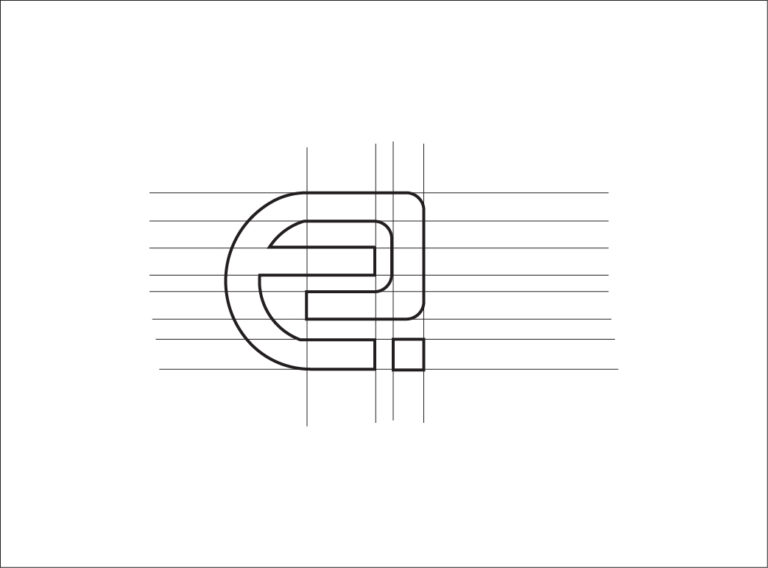
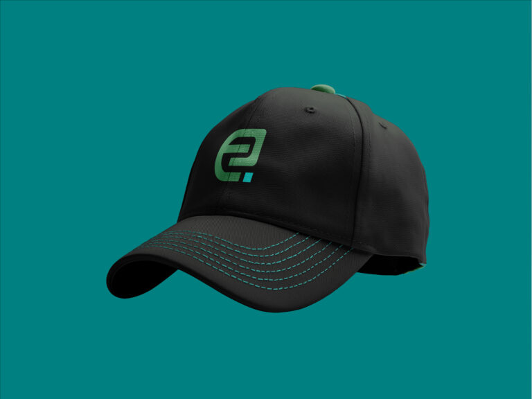
A stylized "E" was developed to represent the brand's journey of transformation. Integrated within the symbol were brick-inspired forms that subtly referenced the craftsmanship and hands-on work involved in creating decorative outdoor spaces.

The intention was not to show construction literally. The intention was to represent the process behind it. This allowed the identity to remain minimalist while still communicating the values of precision, craftsmanship, and transformation.

The color palette was inspired by the natural elements commonly found within Florida's coastal environment.

Drawing influence from the surrounding waters and landscape helped create a visual connection between the brand and the world in which its ideal customers lived.

Typography was selected to complement this direction, reinforcing a sense of sophistication while maintaining clarity and professionalism.

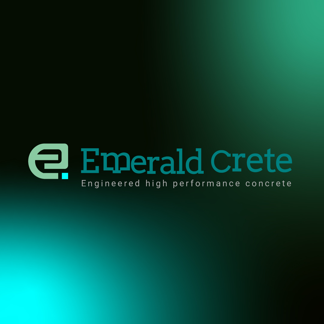
Together, the logo, typography, and color palette created a cohesive identity capable of telling a story without relying on excessive visual complexity.

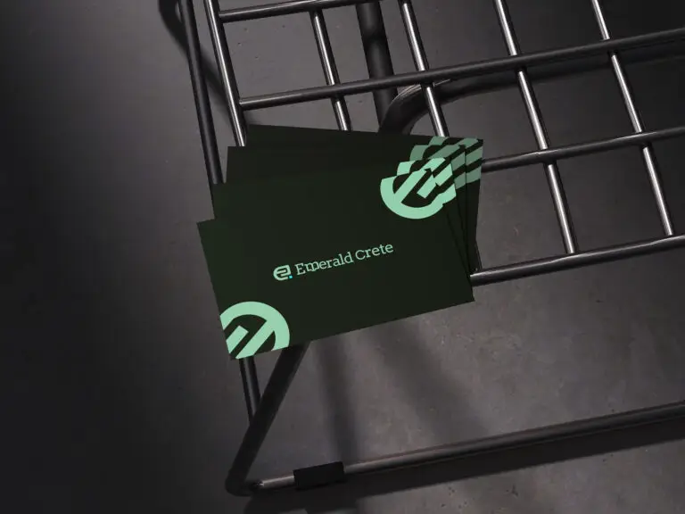
Deliverables

Outcome

The project provided Emerald Crete with a complete visual identity capable of supporting the brand's future growth and market positioning.

For the first time, the business had a cohesive visual system that reflected the quality of its craftsmanship and the premium nature of its services.

More importantly, the identity gave the founders a foundation upon which they could confidently build their online presence and future marketing efforts.

The result was not simply a logo. It was a visual framework designed to communicate the story, values, and transformation that define Emerald Crete's work.

Strategic Takeaway

Luxury is rarely defined by price alone.

More often, it is defined by perception, detail, and the emotions a brand creates before a customer ever makes contact.

The strongest brands understand that people do not simply buy products or services. They buy stories, experiences, and the feelings attached to them. When a brand's identity reflects the world its customers aspire to be part of, it becomes easier to build trust, create recognition, and establish lasting preference. That is why effective branding goes beyond aesthetics. It gives meaning to what a business already does exceptionally well.

Follow Us

Call or WhatsApp
+234 816 8103 200 | contact@jatilo.com.ng

Scroll to Top