Our Approach
One of the first things that became clear during discovery was that Emerald Crete viewed branding differently from most businesses.
The conversation was not centered around colors or logos. It was centered around meaning.
The founders wanted every element of the identity to contribute to a larger narrative.
That required understanding not only the business itself but also the environment in which it operated.
Before exploring visual directions, I researched the brand's physical market and service environment.
Because Emerald Crete primarily served luxury residential properties in Florida's coastal region, it was important to understand the atmosphere, architecture, lifestyle, and visual cues associated with those environments.
The goal was simple:
If the brand wanted to attract a particular type of client, the identity needed to feel familiar within that client's world.
This research influenced every decision that followed.
The visual identity was designed around the idea of transformation.
At its core, Emerald Crete takes something functional and ordinary and elevates it into something beautiful and memorable.
That principle became the foundation of the logo concept.
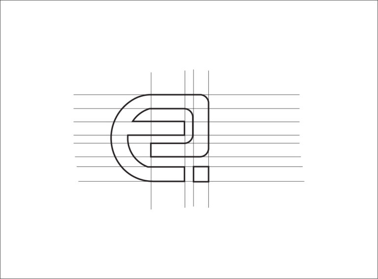
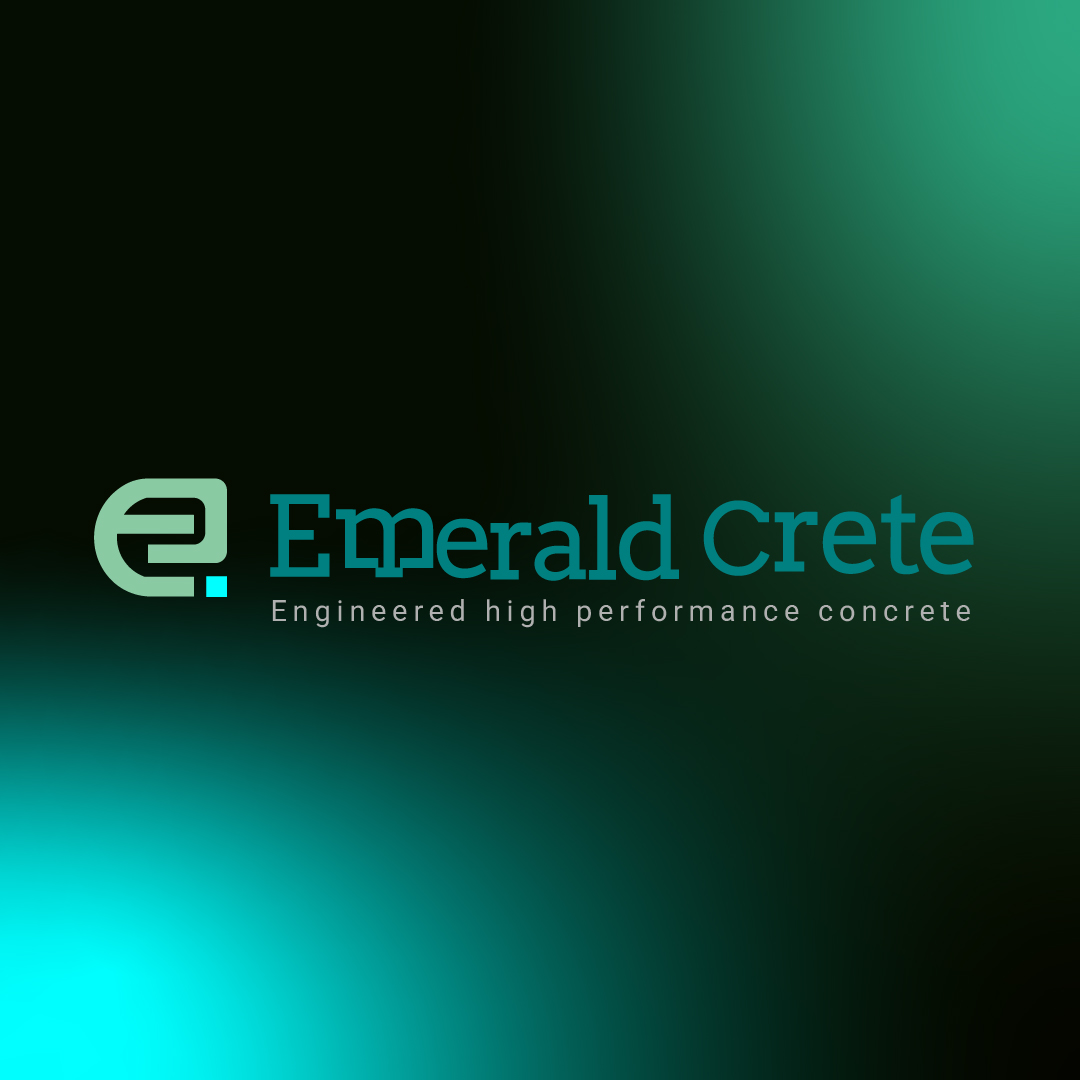
A stylized "E" was developed to represent the brand's journey of transformation.
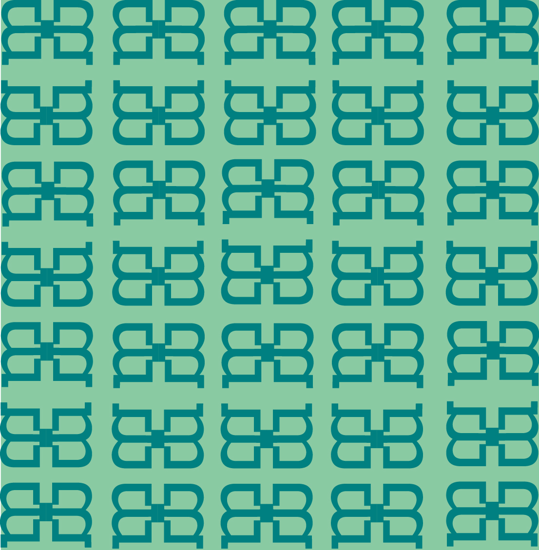
Integrated within the symbol were brick-inspired forms that subtly referenced the craftsmanship and hands-on work involved in creating decorative outdoor spaces.
The intention was not to show construction literally.
The intention was to represent the process behind it.
This allowed the identity to remain minimalist while still communicating the values of precision, craftsmanship, and transformation.
The color palette was inspired by the natural elements commonly found within Florida's coastal environment.
Drawing influence from the surrounding waters and landscape helped create a visual connection between the brand and the world in which its ideal customers lived.
Typography was selected to complement this direction, reinforcing a sense of sophistication while maintaining clarity and professionalism.
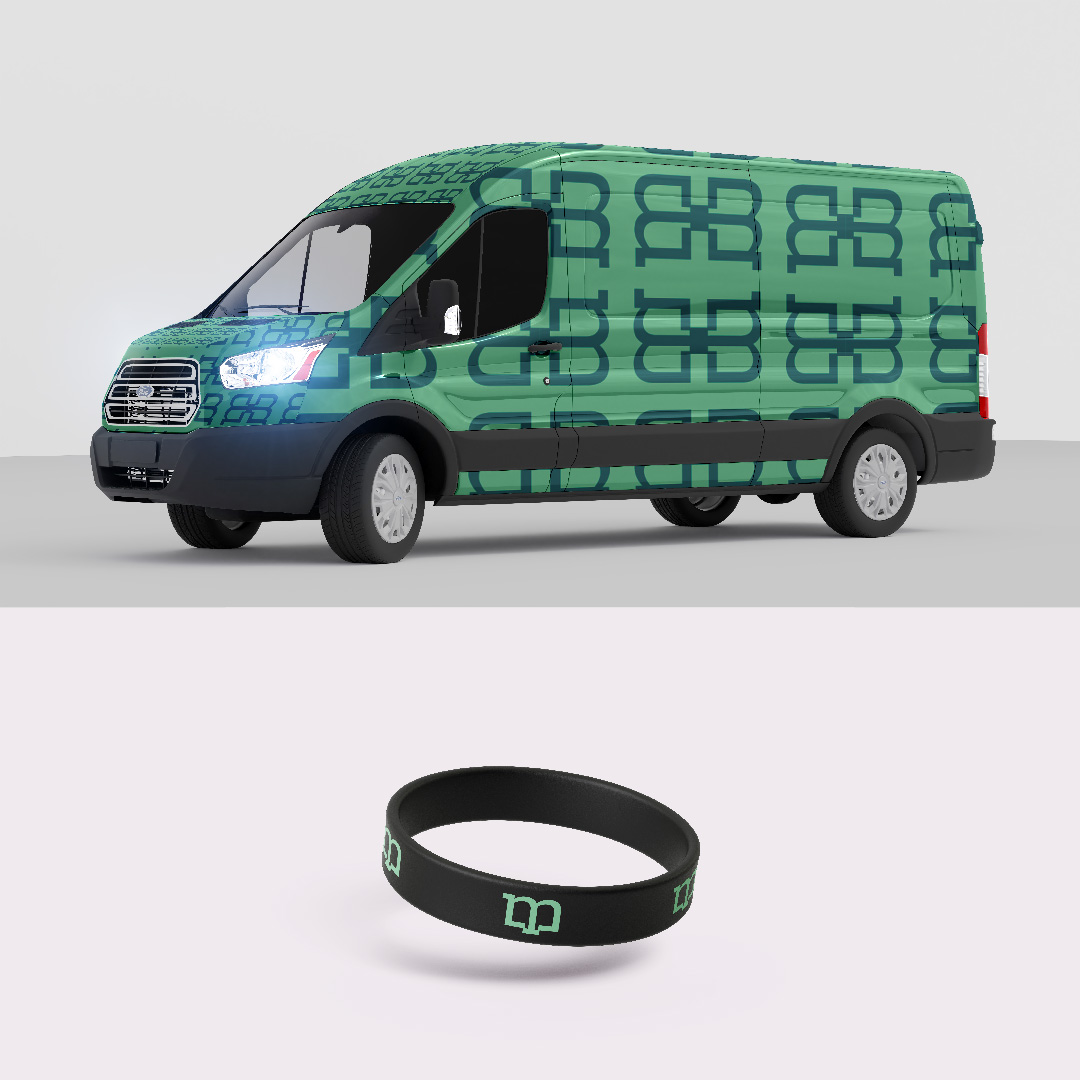
Together, the logo, typography, and color palette created a cohesive identity capable of telling a story without relying on excessive visual complexity.